Enhance App Usability with these Cool UI Design Trends of 2021!


UI design trends are ever-evolving owing to the transformative nature of the software market and the emergence of novel and advanced technologies. The design patterns that were highly popular in the yesteryears are most likely to be replaced by fresh and futuristic styles. Therefore, UI Design Companies, UI design services as well as UI designers must be well versed with the recent market trends to stay competitive.
Modern users enjoy the flexibility to choose from innumerable websites and applications for obtaining the desired service/product. Hence, businesses need to be extra creative, provide enhanced usability and a distinct visual appeal as well as offer new and exciting experiences to grab the attention of their targeted audiences.
Take a quick glance at the distinct and cool UI design trends that are dominating 2021! Adopting the right set of the latest design patterns will not only accelerate your UI designing abilities but also elevate your designing skills to the next level of excellence.
Cool and Exciting UI Design Trends

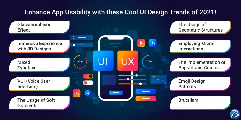
Glassmorphism Effect
Glassmorphism is the most recent UI design trend and is garnering humongous popularity. Apple’s macOS Big Sur launched in 2020 and Microsoft’s Fluent Design System has adopted such a design pattern.
It refers to a frosted glass effect used for blurring out the background for providing transparency. It possesses a multi-layered approach with floating objects such that the users can see through the layers and can establish the hierarchy within the structure and the depth of the interface. This design functions best when several translucent layers appear on a colorful background. Vivid colors are utilized for highlighting the blurred transparency and a subtle light border is used on the translucent objects. And, for achieving the desired effect, only the fill needs to be transparent and not the whole shape.
Immersive Experience with 3D Designs
Delivering an immersive experience via apps and websites is the trendiest practice of modern times. This is executed by employing 3D designs. The depth, special lighting effects, shadows, and textures offered by 3D designs make it possible for users to get an experience that is much closer to the actual world. Whether it’s through typography or illustrations, three-dimensional designs provide an additional dimension to the overall look and feel of the end-product. The increasing usage of augmented reality is one of the reasons that necessitate incorporating 3D designs.
Mixed Typeface
The concept of mixed typeface is predicted to gain prominence in 2021. This phenomenon establishes content hierarchy to create visual interest and plays a major role in boosting the focus as well as the emphasis of a sentence or a title. The best practice is to select a ‘sans serif’ virtually and then merge it with a serif of your choice. This combination will not only function well together but also help you build a nice design. The ‘sans serif’ approach elevates readability as compared to serif and so such a practice perfectly befits the body of the text.
VUI (Voice User Interface)
Interacting with voice interfaces is one of the hottest UX design trends of 2021. The voice interface is an internal one and is related to data synthesis and context. Applications that provide the service of translating words/sentences into the desired language are good examples of this kind of UX/UI design pattern. In such apps, the device starts recording a person’s voice after a button is clicked and then translates the speech. Thus, it becomes easier for individuals to communicate with others who speak a different language.
The Usage of Soft Gradients
Simple web designs and minimalism rules the modern era and as such, the practice of using bright and flashy gradients is no more considered effective. This is because as gradients impart volume and depth to images, it is difficult to achieve the desired effect with screaming colors.
Hence, the practice of using pastel colors in UI design is gaining popularity. This helps in highlighting the unobtrusiveness and lightness of the UI design. Moreover, pastel colors perfectly fit into a wide variety of concepts and establish the ideal environment for various websites such as SaaS applications, eCommerce platforms, etc.
The Usage of Geometric Structures
The usage of geometric structures in interfaces is an existing trend that is expected to expedite in 2021. Here, individual shapes are used for creating bigger and complex shapes for imparting a conservative as well as tidy visual structure. Several UI designers integrate this concept with the phenomenon of optical illusion for generating a memorable momentum.
Employing Micro-interactions
Micro-interactions refer to the pleasing and delightful moments experienced by customers while using a product. These short moments add immense value to your product by offering a truly humane experience to the end-users. Such visual elements function best when combined with users’ action triggers. Micro-interactions prove beneficial as they enhance the usability of a product, promise an improved ROI, and work wonders in retaining customers and making a product popular.
The implementation of Pop-art and Comics
The recent times are all set to launch feel-good designs that make use of colors in an unexpected and quirky manner. Designs that display pop art and comics are ideal examples of such statement designs. These innovative and fun-filled designs are sure to attract users and engage them in a meaningful way.
Emoji Design Patterns
Emojis undoubtedly enable app creators to express a lot despite having a minimalistic UI design. This emotion–expressing concept makes an interface far more enjoyable and engaging. This is the reason why most popular apps these days have adopted this concept. Emojis are being used in empty states, onboarding screens, push notifications, dialogs, etc. by not only social apps, but also applications belonging to serious business domains like eCommerce, banking, and finance.
Brutalism
As the name suggests, this design seems quite unusual due to the usage of strong contrasts and unpleasant typography that might seem chaotic to many. This design often causes issues concerning readability and accessibility. Yet popular brands such as Foursquare and Dropbox have adopted such a concept. The primary objective behind employing such designs is to offer a deconstruction that is perceived as attractive and handy.
Concluding Lines
Well, what are your views about these refreshing and stimulating UI design trends? Please share your thoughts in the comment section provided below. If you are looking for assistance to decide on the right set of UI design patterns for your website or mobile app solution or planning to hire high-end UI designers; contact Biz4Solutions, a prominent and highly experienced offshore software development company, and reliable technology partner.
To know more about our core technologies, refer to links below:
Other articles and publications:
Articles and publications of other companies:
- +1 (469) 277-0804
- 8305 Tripoli Trl, Frisco, TX 75034, United States
- www.biz4solutions.com/


